- Dale Ludwig Myths Debunked, Presentations
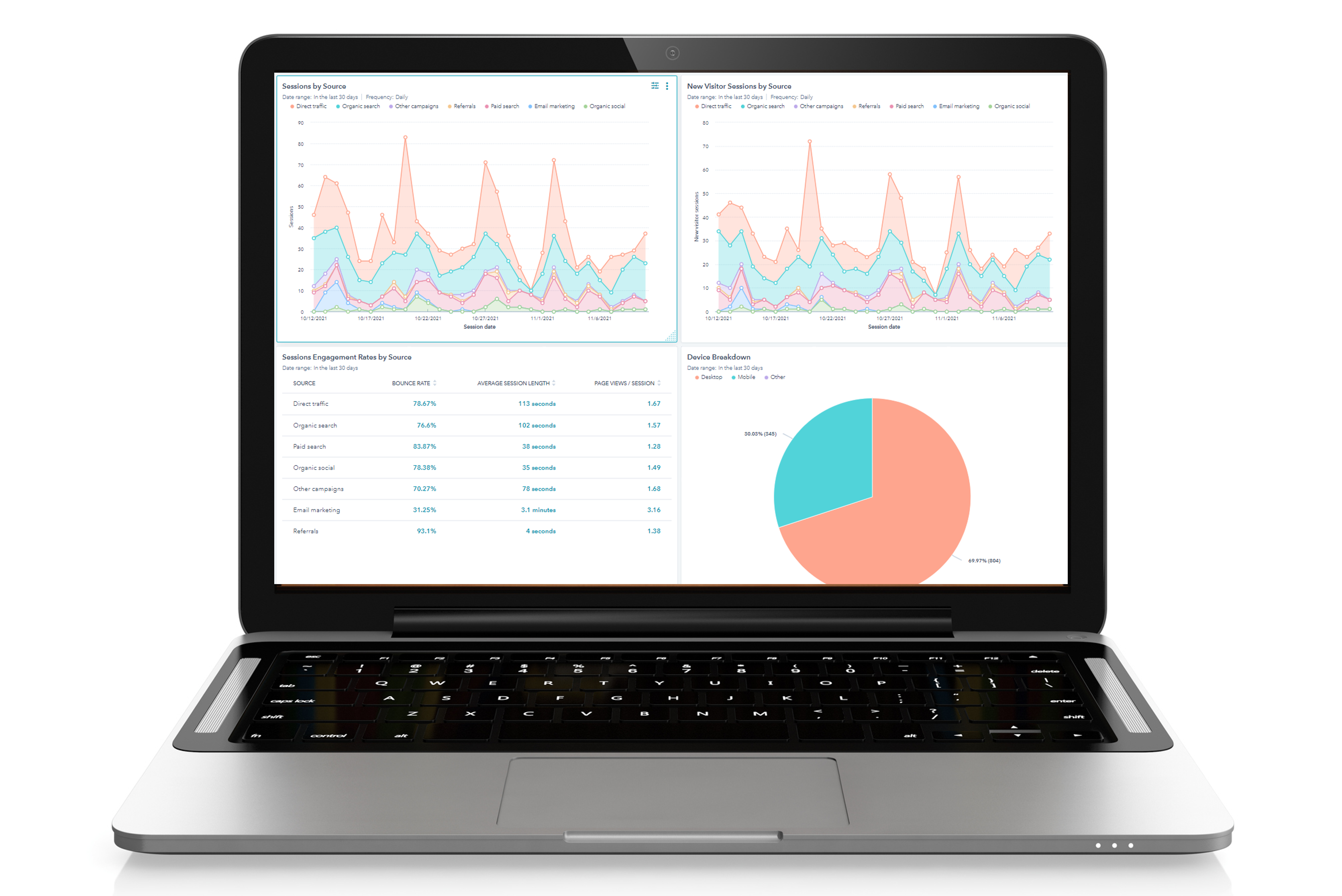
This is the third in a series of four articles about the need to take a fresh look at the visuals you use in your presentations. In this article, I’ll talk about images that you use during your presentations that exist on their own outside of it (things like sales numbers, financial reports, marketing data, flow charts, and org charts). All of these things are essentially documents intended to be read.
When faced with the challenge of delivering this information, either you change the document to make your point clear (thereby making the document an effective visual aid in the traditional sense), or you leave the document as it is and guide the audience through it during delivery.
Whichever way you do it, you need to make sure your decision is appropriate for the audience.
If business presentations were always simple, predictable processes involving very little interaction between you and your audience, your choice is easy. You would transform the document into a well-designed visual. You would simplify, streamline, edit, and determine precisely what the audience’s takeaway from the slide is.
But, because presentations are usually not simple or predictable, it’s not always possible to transform data into beautiful slides. Your audience may want or need more information than a well-designed slide will allow. They may want the details so they can discuss them with you. They may be stubborn or resistant and expect you to give them the information they need to be persuaded.
In these situations, you’re better off giving them the data and all of its details to look at.
Just keep in mind that when you do this, the focus in the room changes. It shifts away from you and toward the visual. When that happens, the presentation becomes a group discussion, and you become the facilitator of it. When the conversation about the data is over, you assume your role as presenter again, but for that short period of time, your responsibilities are different.
Why is this an important distinction? Because you have to let the discussion take place. That requires giving up some of your control and letting the audience determine where the conversation goes. It’s important to make sure they know what they’re looking at and why. They need time to think, question, and discuss. Your job is to let the data become the subject of the conversation without derailing the presentation.
This process is another example of how your business presentations are different than formal speeches. Presentations often require an in-depth examination and discussion of the information. The visuals you use—regardless of their origin or design—should make the process as easy and productive as possible.
In the final article on this topic, I’ll discuss slides meant to bring emphasis or emotion to your presentations.

