
- Greg Owen-Boger Myths Debunked, Presentations, Subject Matter Experts
A recent workshop participant said, “I don’t want to simplify this slide. The abundance of the data is where the story is.”
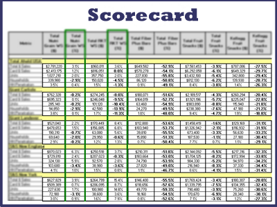 As his coach, I cannot argue with that. This is exactly why those one-size-fits-all rules about the number of bullets or words on a slide don’t work.
Admittedly, sometimes less is more. (And we do help our clients simplify their slides and their message when necessary.) But as this workshop participant said, sometimes the message is better communicated through lots of data.
Slide Vs. Handout
The slide pictured here would be, admittedly, a lousy visual aid if it were projected onto a screen. It’s too busy and would be hard to read, so in cases such as this, be sure to include a hard copy of the slide so that people can read and study it as part of your presentation.
I encourage you to think critically about the rules you’ve heard about slide design and business presentations. As Dale Ludwig, Turpin’s founder, often says, “If a slide doesn’t help you move the conversation forward, it’s a lousy visual aid.”
What “rules” for presenting do you break?